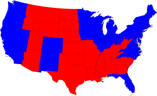
and then went on to a cartogram of the same, based on population:

However, this only accounts for popular vote. Newman also, interestingly, shows us a cartogram of vote by electoral college, where for example we can note Wyoming as doubling in size.
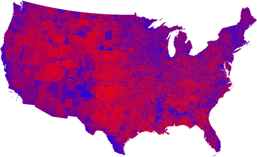
The next set of visualizations deals with county-level views, to drill down to the next level below states - here the urban/rural divide can be noted, as well as some other geographic trends.
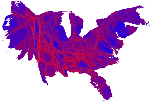
Newman also provides further nuance, with a series of maps and cartograms showing a linear graduated color scheme, based on percentages of voters voting either Republican or Democrat:
And then, a population-based cartogram of the same:
Newman provides considerable additional insight and several more maps and visualizations at his website: http://www-personal.umich.edu/~mejn/election/2008/.
UPDATE: Per Andy Anderson on the NEARC-L listserve (Northeast Arc Users Group),
The Gastner-Newman cartogram software has been implemented as an ArcScript by ESRI's Tom Gross: http://arcscripts.esri.com/details.asp?dbid=15638

No comments:
Post a Comment